Badge
Table of Contents
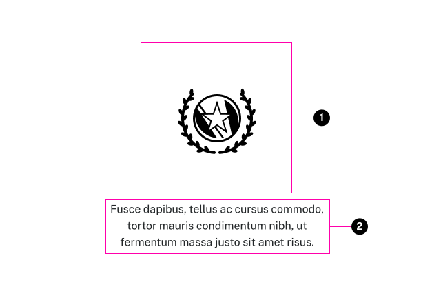
Anatomy

- Image
- Text (optional)
Usage Guidelines
A Badge can be used 'inline' in content components, or you can place a Badges slider component in a page.
- This component can be used within other components just like regular text
- The images are centered in a square, downsized while maintaining their aspect ratio
- Images should have transparent backgrounds
- It is not required to crop them before upload
- Caption is optional, and may contain other inline elements to style text or insert links.
Specifications
Properties
| Property | Type | Description | Required | Default |
|---|---|---|---|---|
| image | integer|string | WordPress image ID or image URL. Images should be square and at least 256px x 256px. | Yes | - |
| text | string | description of the image. | No | - |
| class | string | list of additional classes to apply to main element. | No | - |
Changelog
5.1.0 (2023-07-03)
- fix: add exist check for php8 warning in block (a2f5cba)
1.13.0
- badge added
Examples
Default

Fusce dapibus, tellus ac cursus commodo, tortor mauris condimentum nibh, ut fermentum massa justo sit amet risus.
{{ include( 'components/badge.twig', {
	image: "badge-placeholder.svg"
	text: "Fusce dapibus, tellus ac cursus commodo, tortor mauris condimentum nibh, ut fermentum massa justo sit amet risus."
} ) }}No Text

{{ include( 'components/badge.twig', {
	image: "badge-placeholder.svg"
} ) }}