Hero
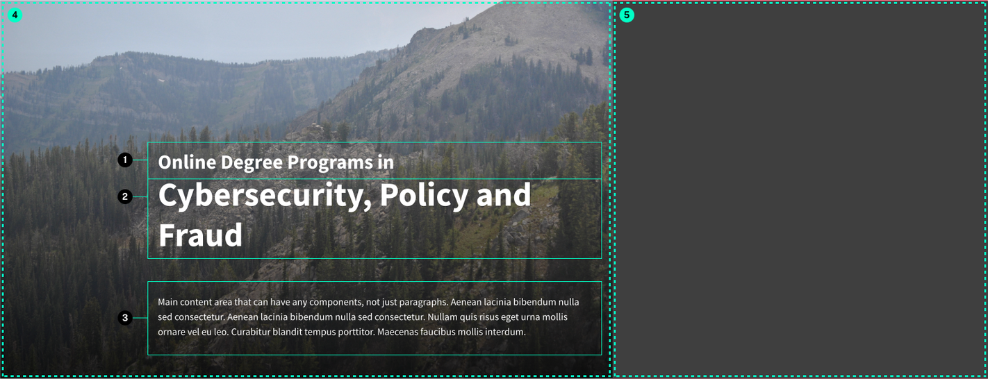
Anatomy

- Heading
- Subheading
- Content - freeform content area
- Background Image
- Form area (optional)
Default buttons are styled to work on light backgrounds while maintaining a high enough contrast ratio, while the inverse buttons are used when a button needs to be placed over a dark background.
Usage Guidelines
Useful as an introduction at the top of a page to provide visual interest and a strong call to action.
Accessibility
Make sure to set the correct heading level for the subheading/heading text. If using this component at the top of a page in place of a standard page title, the heading level should be set to an H1.
Check the contrast of the text against the selected background image to make sure that everything is readable enough. There are several modifiers that can place a solid background color behind the heading, subheading, and content or different levels of a gradient for a more subtle effect while still helping readability. If you don't have any regular body size copy in the content and only have a heading, you can get away with a lower contrast level since the text on the heading will be much larger.
Specifications
Properties
| Property | Type | Description | Required | Default |
|---|
Styling
Changelog
6.10.0 (2024-05-01)
2.4.0 (2023-01-04)
1.27.2 (2021-12-30)
- fix: chaning scss variables in the hero components (062a9ea)
1.17.0 (2021-03-11)
- fix: boxed modifier - add toggle in editor and remove overlay (#61) (32dbe76)
- feat: add transform for legacy ACF Hero block to new Hero B (#55) (ad21468)
1.5.0 (2020-06-23)
- fix: correct height and position in ie (fe9ee44)
1.3.1 (2020-05-13)
- fix: inherit color on heading for certain situations (e6905a7)
1.3.0 (2020-05-08)
- fix: add overlay for boxed version on lg breakpoint (33ae337)
- fix: conditionally include ul if more than one action (736eadf)
- fix: consistent styling on mobile for boxed layout (18730b4)
1.0.0
- hero added
Examples
Default
{{ include( 'components/hero.twig', {
	image: "hero-background-lg.jpg"
	heading: "Malesuada Venenatis Pellentesque Ridiculus Justo"
	h_level: 1
	h_class: "h2"
	subheading: "Donec ullamcorper nulla non"
	actions: {...}
} ) }}Boxed Layout
{{ include( 'components/hero.twig', {
	image: 239
	boxed: true
	heading: "Example Hero"
	h_level: 1
	h_class: "h2"
	subheading: "Program Overview"
	actions: {...}
	content: "<p>Sed posuere consectetur est at lobortis. Vestibulum id ligula porta felis euismod semper. Nulla vitae elit libero, a pharetra augue. Donec sed odio dui. Donec id elit non mi porta gravida at eget metus. Nullam id dolor id nibh ultricies vehicula ut id elit.</p>"
} ) }}